It looks familiar, but that's where the similarities end.
I often think about the pressure movie directors are under to produce sequels that are not only better than the originals but more successful, more entertaining, more profitable. The Godfather Part II, Toy Story 2, The Empire Strikes Back, Paddington 2 — follow-ups that built upon legacies, expanding storylines, growing character arcs, and ultimately leaving the brand better off than where it started.
Such maxims don't work perfectly in the technology industry, but it's rare a sequel has been so anticipated as the BlackBerry KEY2 — at least among a small, loyal group of followers. But those supporters are the ones that never doubted the inevitable success of the KEYone, whose legacy was awkwardly forged in the unity of BlackBerry and TCL, which has since created a separate brand, BlackBerry Mobile, under which it plans to flagship phones. Phones like the KEY2.
| Spec | BlackBerry KEY2 |
|---|---|
| Operating System | Android 8.1 Oreo |
| Display | 4.5-inch, 1620x1080 IPS LCD 434ppi |
| Processor | Qualcomm Snapdragon 660 4x Kryo 2.2GHz, 4x Kryo 1.8GHz Adreno 512 GPU |
| RAM | 6GB |
| Storage | 64GB / 128GB |
| Expandable | microSD up to 2TB |
| Rear Camera 1 | 12MP (1.3 micron) ƒ/1.8 laser+phase autofocus dual-tone LED flash |
| Rear Camera 2 | 12MP (1 micron) ƒ/2.6 2x optical zoom portrait mode |
| Front Camera | 8MP Selfie flash 1080p/30 video |
| Battery | 3500 mAh non-removable |
| Dimensions | 151.4mm x 71.8mm x 8.5mm |
As far as sequels go, this one is pretty conservative. But given the KEYone's loyal following, and projected success (though TCL hasn't released sales figures), changing too much would be have construed as a betrayal.
But BlackBerry focused on improving areas of criticism from the first phone, especially performance. To that end, the phone has a beefier Snapdragon 660 — a substantial upgrade from the Snapdragon 625 of the original — along with 6GB of RAM in every model and an ample 64 or 128GB of storage. It's got dual rear cameras, a stronger series 7 aluminum frame, and a drastically improved keyboard with keys 20% larger, and far more tactile, than on the KEYone.
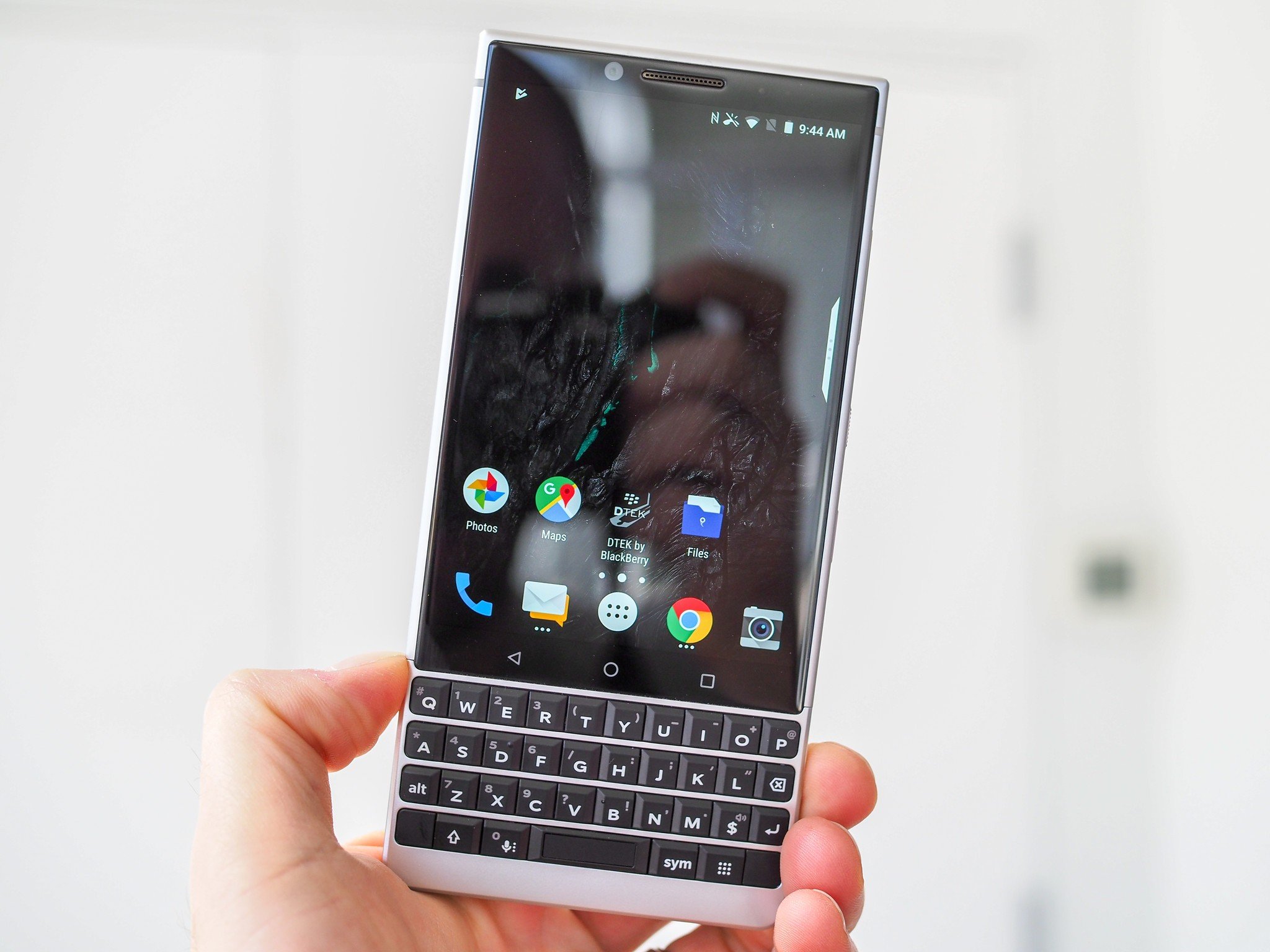
Both the robust frame and redesigned keyboard are part of an overall cleanup and modernization of the phone's exterior. Most importantly, the bulbous front camera and sensor cutouts of the KEYone have been more seamlessly integrated into the bezel atop the 4.5-inch LCD panel, and the earpiece is more sunken, allowing for richer sound.
As far as sequels go, this one is pretty conservative. But that's OK, because the original was surprisingly good.
In fact, despite the presence of the keyboard, the KEY2 looks far more like a traditional phone than its predecessor in almost every respect. Thankfully, that extends to the placement of the power button, which is wedged between the convenience key and volume rocker on the right side of the phone. Its ridged texture distinguishes itself from the other buttons, which is a nice touch, but the fact that it's there, on the right side where it should be, is reason enough for me to get excited about this phone. (I jest, but not really.)
This leaves the left side of the phone to deal with the SIM tray alone, all angles and matte finish. Putting the KEY2 next to the KEYone shows exactly where TCL's designers focused their energy: on removing the shiny, cartoonish elements of the original. The KEY2 comes in two colors, black or silver, and both feature brushed aluminum finishes that speak more to my understanding of BlackBerry's professional legacy.
And even if your association with BlackBerry is more BBM than holster, the takeaway for everyone looking at the KEY2 without irony (because many people still view a physical keyboard on a phone as a useless indulgence) is that it's objectively much better looking than its predecessor.
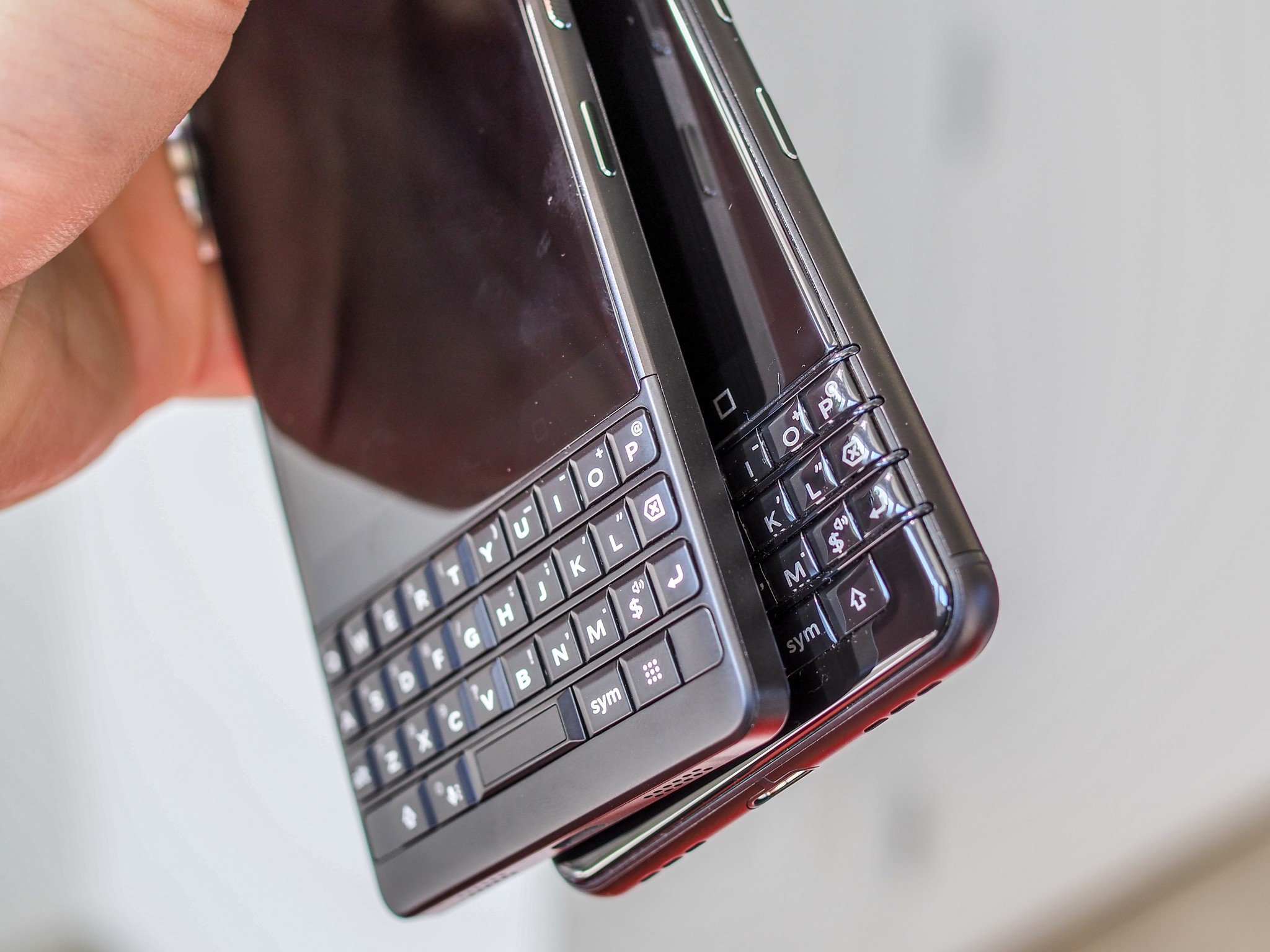
That brings us to the keyboard. BlackBerry Mobile says the keys are 20% larger than before, and more evenly spaced thanks to redesigned frets. But perhaps the most significant improvement is the key finish, which is also matte.
That's a big deal, because while the glossy KEYone may have looked good out of the box — all shiny and new — the keys got grimy and slippery after a few month's use. Hopefully that won't happen with this one.
While I haven't spent much time with the KEY2's keyboard, it's clear the phone is much, much easier to type on. I've used every keyboarded BlackBerry since 2004's 8700 'Blueberry', and I see a lot of potential with this one. It's closer to the Bold 9900, still considered the best hardware keyboard ever made, than the KEYone, and to me that's important.
Replacing the right Shift button is the new Speed Key, which works as a 'function' button of sorts. Holding it and pressing any one of the keyboard's 26 letters can open any app or activate any shortcut the system can muster, from beginning a text or email to opening the camera or Instagram. There are 52 possible combinations, too, since you can hold on the Speed Key and long-press any letter of the alphabet.
Such functionality is estimable on the KEYone, but only from the home screen (and only using the BlackBerry Launcher). This bypasses all of those prerequisites, giving avid multitaskers more ways to manically accomplish tasks on the go. It's unclear how much I'll use this feature, but given that the Speed Key replaces a largely redundant second Shift key, there's nothing but upside to the decision.
I'll spare you the monologue about whether it's necessary having a phone with a physical keyboard in 2018. BlackBerry Mobile made the KEYone because there was so much pent-up demand for such a phone running Android. It made a sequel because it was confident it could make money from the enterprise. Who am I to judge those who find a keyboard more productive, or don't mind the sacrifices, from screen size to waterproofing, that come with the form factor?
Sure, I'd like a waterproof KEY2 with wireless charging and a Snapdragon 845, but it would cost $1200 and be twice as thick — and twice as ugly.
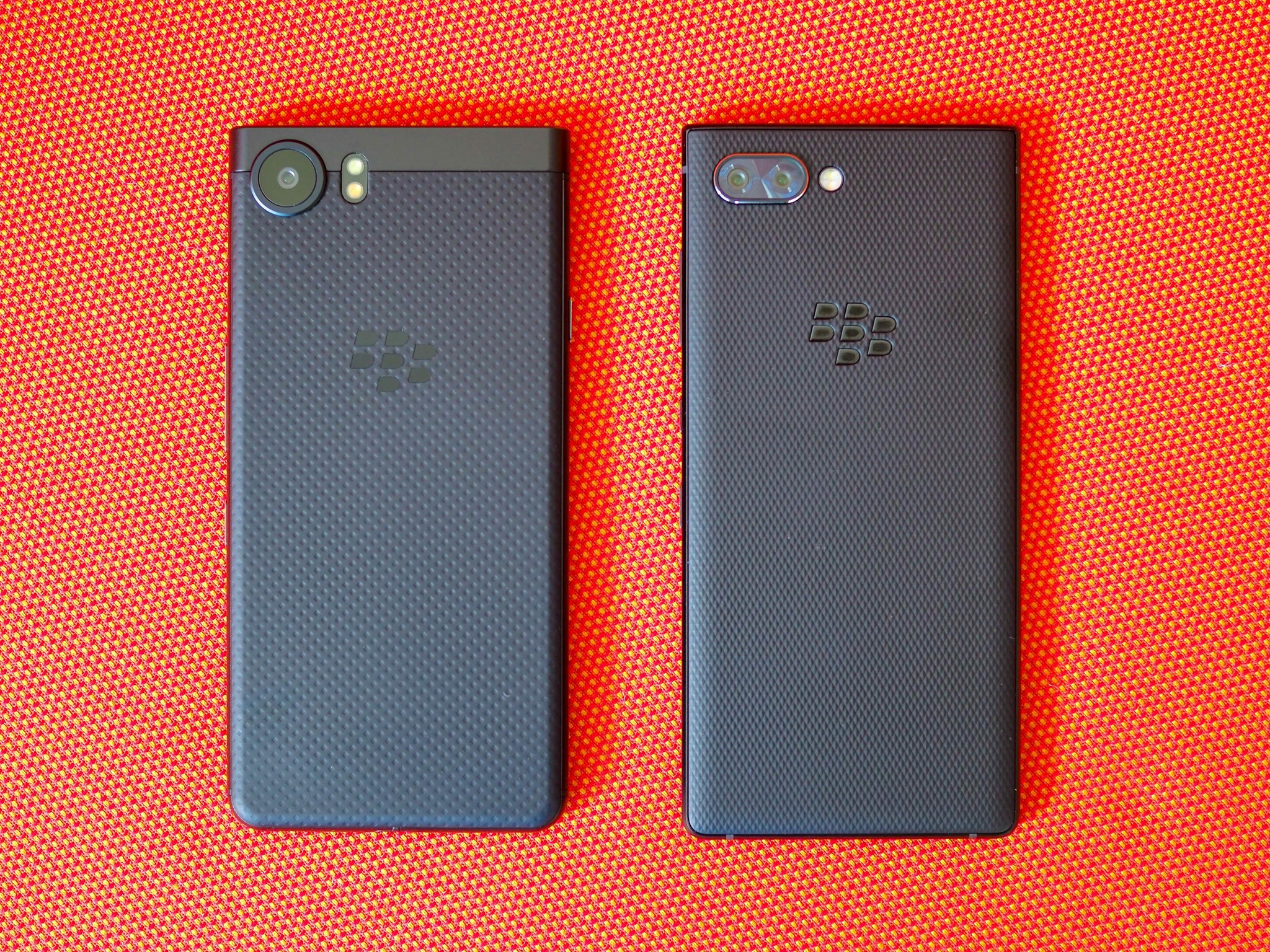
Continuing the KEY2 tour, around back there's a familiar textured back that BlackBerry Mobile says is ever-so-slightly redesigned to be even more comfortable to hold than before. If that's possible.
If you stare at the back long enough, you'll notice a second camera sensor adorning the primary, offering features like 2x optical zoom and portrait mode. Both sensors are 12 megapixels, and the primary one has received a minor upgrade in a wider, faster ƒ/1.8 lens and a slight downgrade in the form of smaller 1.3 micron pixels (the KEYone famously shared the same IMX368 sensor with 1.55 micron pixels as the Google Pixel).
The camera on the KEYone was better than it had a right to be. Here, I'm hoping for the same thing.
I haven't had a chance to take any photos with the KEY2, so I don't know whether the smaller sensor will have a negative impact on photo quality, especially in low light, but I'm eager to test it out.
I also haven't been able to use the phone long enough to see whether the KEYone's legendary battery life has been transferred over to its sequel. With a 3,500mAh battery and something called a "Smart Battery Experience" that bases charging recommendations on your usage patterns, it should last at least as long as the original, and possibly longer given the custom-core efficiency of the Snapdragon 660.
As we bring this film to a close, we have to talk about software, and the legacy of BlackBerry itself. With Android 8.1 on board and the KEY2 certified as part of the Android Enterprise Recommended program, I'd be remiss not to point out that the phone, as popular as it is with a small number of enthusiasts, is really aimed at the enterprise market.
To that end, the KEY2 maintains its predecessor's focus on privacy and security, promising monthly security updates (bested only by Google itself) and, as part of the AER, "at least one major OS update." So you know that the KEY2 will get Android P — eventually. For what it's worth, the KEYone is still on Nougat and is expected to get Oreo shortly after the KEY2's release.
Mainstay apps like DTEK have received visual updates to improve usability, and the BlackBerry Locker now has built-in document support so files stored on the phone don't need to be uploaded to the cloud. (Imagine 10 years ago the notion that a phone needed a specialized locker to prevent files from automatically being uploaded to Google's servers. What a world we live in.)
More interesting is a partnership with Mozilla to pre-install Firefox Focus, its new super-fast, privacy-focused browser, within the locker, so nothing is tracked and everything is kept out of advertisers' prying eyes.
I'll be honest, I'm excited for the KEY2. The primary reason to buy a BlackBerry is for its keyboard, and that seems to be an area the company has worked hard to improve this time around. I didn't love the KEYone's keyboard — it never felt comfortable to type on for long periods — but I'm optimistic about the changes made to the KEY2.
The primary issue with the phone will be price: at $649 USD unlocked, it's an extra $100 on top of what the KEYone demanded, and despite the hefty specification improvements, it's a hard pill to swallow. At this point, we don't know carrier specifics for the U.S., but BlackBerry Mobile says, as usual, the phone will launch first at Canadian carriers, where it will sell for $829. In Europe, it will be €649 or £579. The phone launches later this month.
from Android Central - Android Forums, News, Reviews, Help and Android Wallpapers https://ift.tt/2Jkuexi
via IFTTT


No comments:
Post a Comment