
When most compare Android to iOS, the first thing people typically bring up is that Google's mobile operating system is customizable while Apple's is rigid and set in a walled garden. While this can be argued for and against, one of the critical aspects of each operating system is how they handle notifications.
As Apple recently introduced new notification grouping in iOS 12 and Google has been working to provide Android users with more control over notifications, let's take a look at the strengths and weaknesses of each mobile operating system.
Grouping notifications

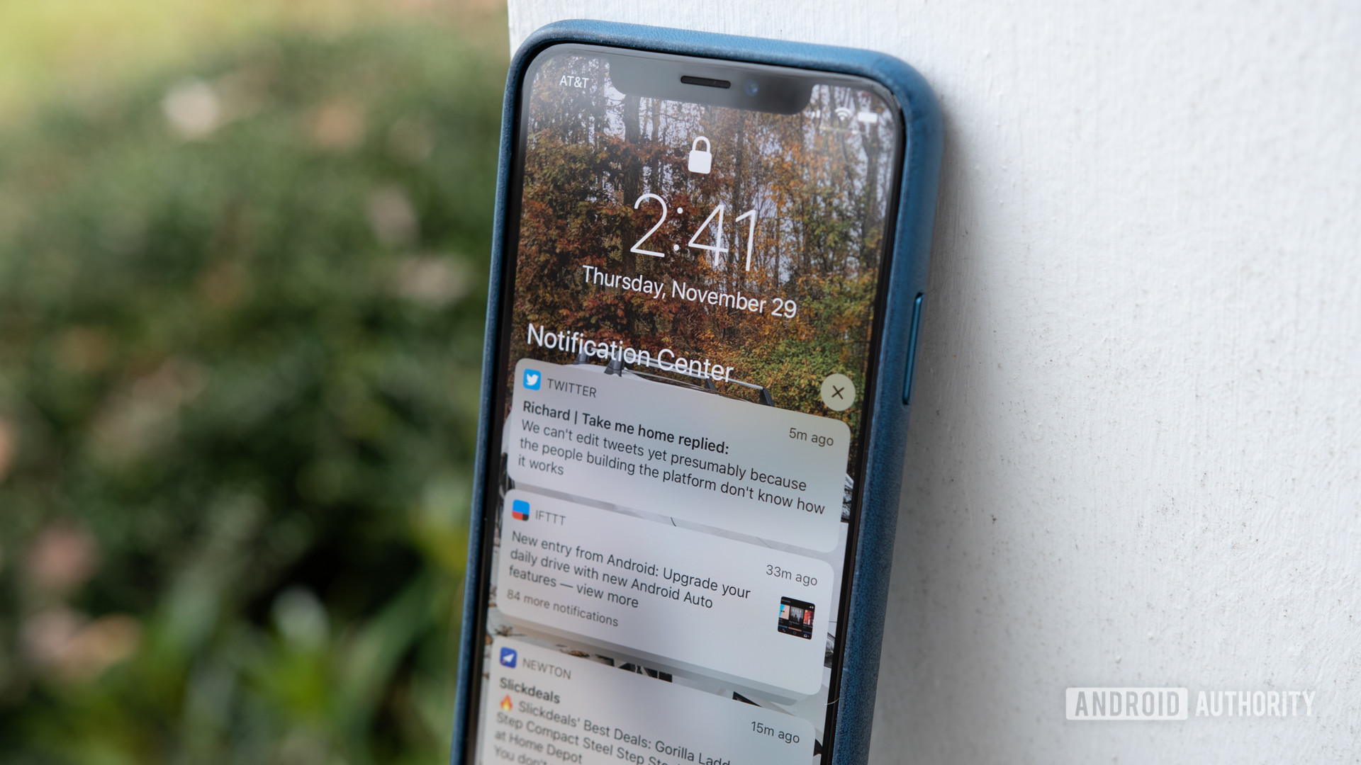
Apple as a company took a significant step forward with iOS 12 and introduced a feature users have been requesting for years: notification grouping. With the update installed, iPhone and iPad owners no longer have a long-running list of incoming notifications. In its place is a long-running list of incoming notifications that are grouped by whichever they came from.
If it sounds like Apple's new notification grouping feature is still a pain point, that's because it is. This will be touched on in another section.
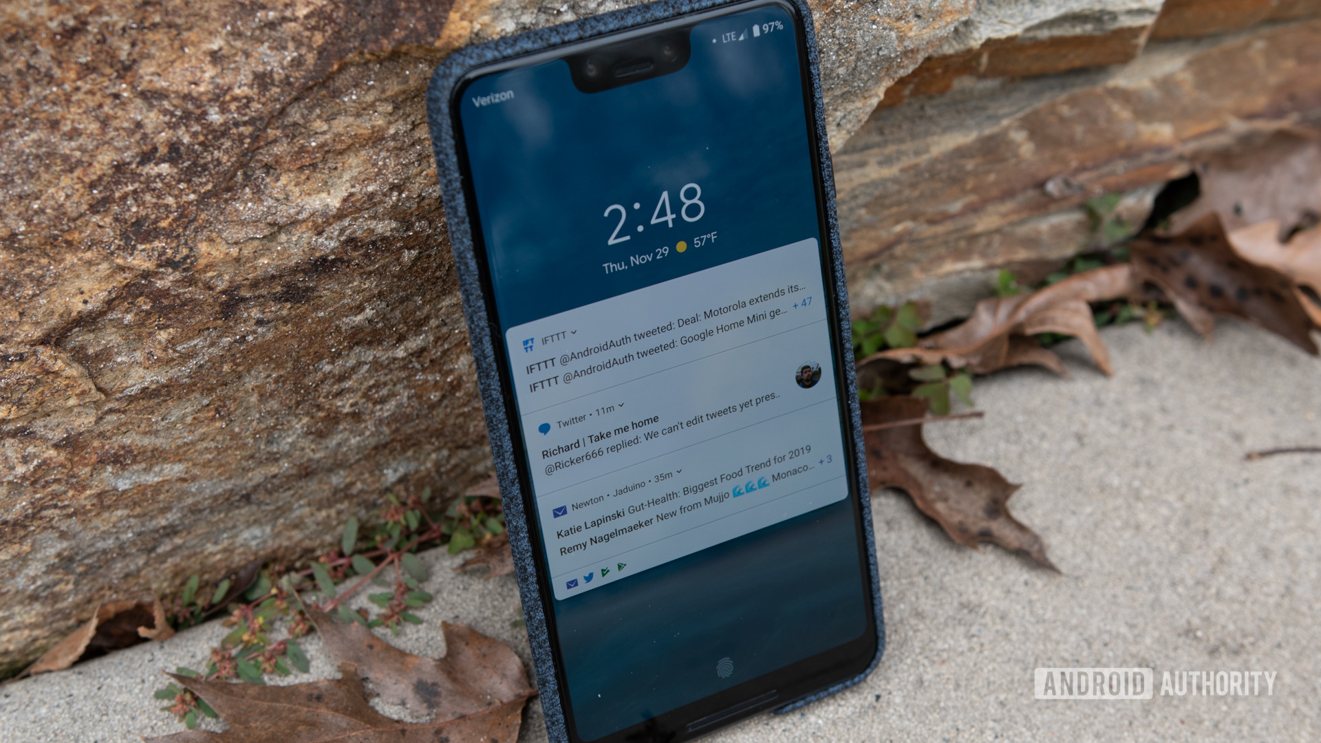
Google first introduced grouped notifications, or bundles, with the release of Android Nougat in 2016. By stacking or combining all of the incoming notifications from a single app into a single card, users wouldn't have to worry about a cluttered status bar.
The implementation of bundles have been improved upon in Oreo and now Pie, but the feature became a hit and was widely adopted within the Android app ecosystem.
As previously mentioned, a similar notification grouping feature was added with the release of iOS 12. Each of these groupings shows the name of the app that supplied the notification, how many notifications there are to view, and displays the preview of the last notification to come in.
I will note that not ever app follows this practice by default. Twitter, for example, groups notifications based on the sender of the tweet. Instead of every notification from the social network showing up in a single grouping, I have multiple groupings, each one based on the account who shared something on the platform. Fortunately, this can be changed in the app's notification settings.
Related: Samsung Galaxy Note 9 vs iPhone XS Max: Which is worth your $1,000?
Lastly, Android sorts the groupings of notifications by importance instead of leaving everything in chronological order like iOS. While it's nice having the latest notification right at the top of the list, I find it much more useful when Android places texts and urgent messages front and center. It helps me not lose track of them in the chaos of other incoming notifications.
Interacting with notifications

This is a section where iOS and Android are pretty much neck and neck, but Android still retains the lead. While implemented in slightly different fashions, both operating systems give the user almost identical options when interacting with the notification.
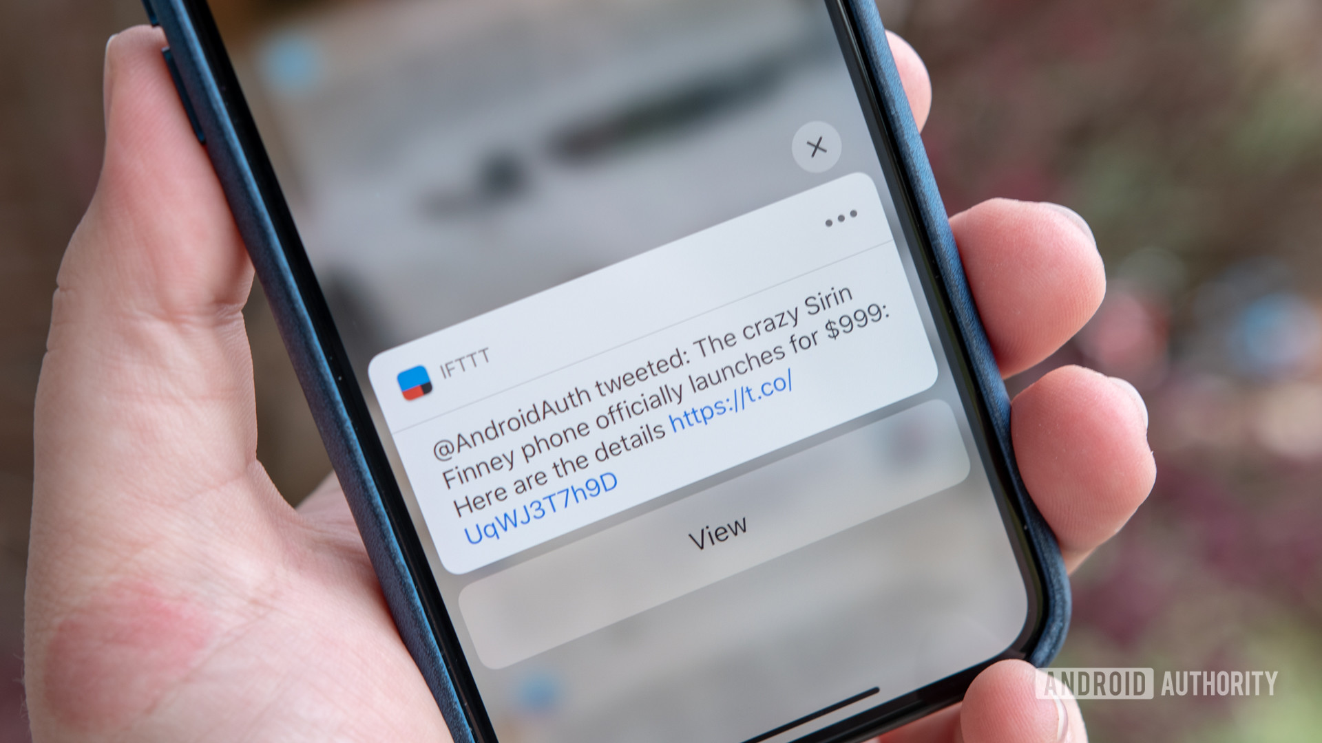
Using Twitter as the example again, on Android, you can swipe downward on an individual notification and choose to Reply, Retweet, or Like the Tweet. These same actions are available on iOS, but it requires you to swipe the notification card left or right, tap on the View button, and then interact with the tweet once things were finished loading.
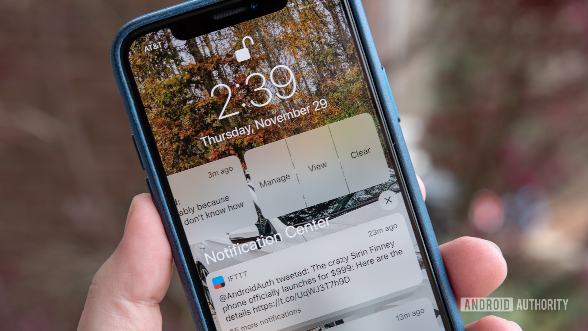
Dismissing notifications is also a lot easier on Android. With a simple flick to the right or left, the card is gone and never to be seen again. On iOS, you slide the notification to the side and then you can tap on the Clear button to get rid of it.
The process is almost identical for groups of notifications. On Android, swiping the group one way or the other dismisses the whole bunch. On iOS, sliding over the bundle brings up a Clear All button. Additionally, after expanding a group of notifications on an Apple device, there is an X button that can clear everything away.
If you just want to clear away every notification on the phone in one grand sweep, both operating systems allow you to do that.
I will admit that the extra steps required by iOS to dismiss notifications can get annoying, but it adds a safeguard so that you don't accidentally dismiss something. Far too often I somehow swipe away an entire group of notifications on Android when I meant only to get rid of one. By making it a two-step process on iOS, this isn't a problem.
Notification settings

Over the last several versions of Android, Google has added additional controls that allow users more authority over app notifications. Instead of just wholly allowing or blocking an app from throwing up notifications whenever it wants, the user can now go into any app through the Settings and adjust what they do and don't want to see.
Comparing the options made available for Twitter on both operating systems, iOS does give the user a lot more control over where and when they would like to see notifications.
On Android, the user can choose to disable all notifications or individually turn off types of notifications. Google calls these channels.

All of these settings are offered on iOS in addition to so much more. On an iPhone or iPad, the user can decide if they want to see a notification on the lock screen, in the notification center, as a banner, or any combination of the three. They also have control over if incoming notifications should inform the user with a sound, show badges, and display previews of the alerts.
While Android has come a long way over the last several years, iOS offers a lot more notification customization options on a per-app basis.
Why Android is still the champ (in my opinion)
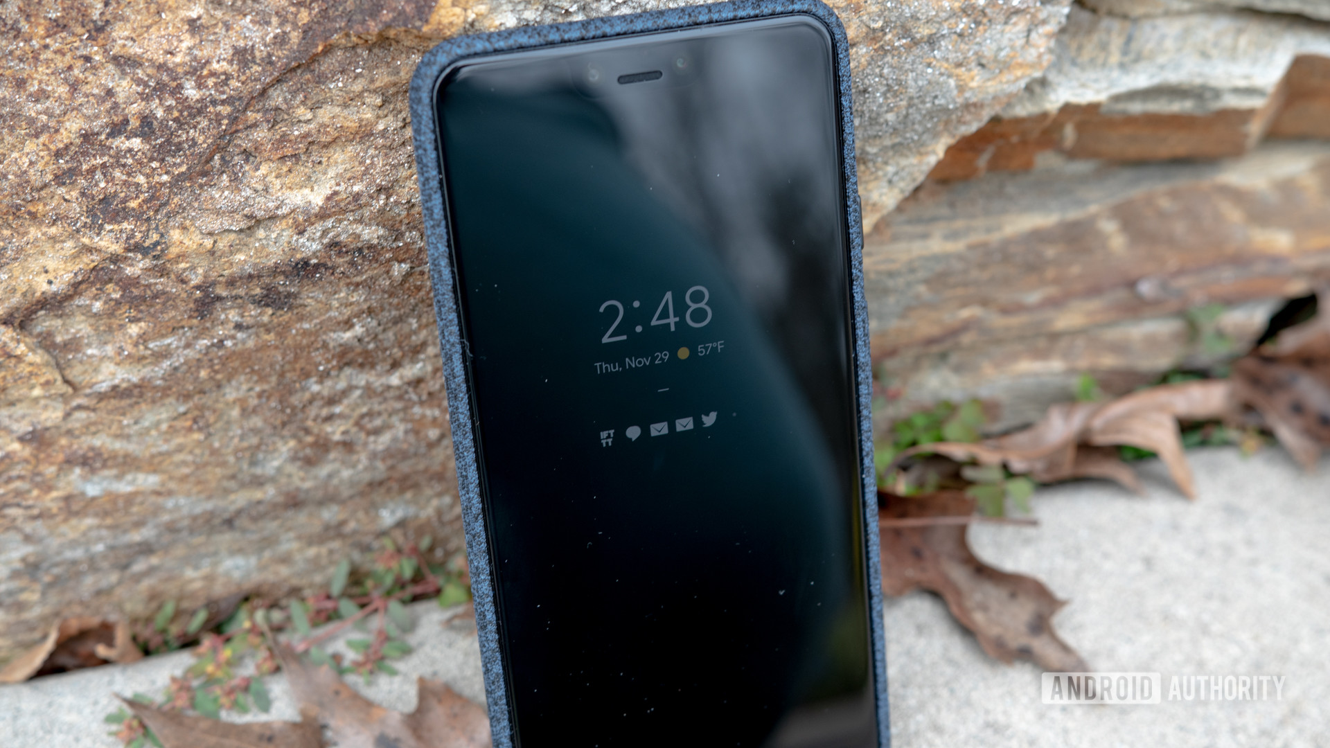
As I made clear at the beginning of this comparison, I am not a fan of how iOS handles notifications. On Android, notification icons are ever present whether you're looking at the lock screen or the status bar. By always having the notifications front and center, the operating system makes sure you don't miss out on information that might be important to you.
With iOS, notifications are hidden and out of sight, almost as if Apple expects you to search for incoming notifications if you know that they might be important.
When the iPhone XS came out, I temporarily made the switch to iOS. It was a welcome change (wow, apps are built so much better for iOS), but I had an ongoing struggle with notifications. Because of the way that things are tucked away, I would constantly miss messages only to stumble across them hours later.
Read next: An Android fanboy spends an enlightening week with an iPhone
Now before anyone writes a comment, yes, iOS does feature notification badges that highlight how many unread messages and alerts that you have. This only supports my argument about having to hunt and search for your notifications.
An argument can and has been made against Android and how it pushes users to keep checking and dismissing notifications so that they aren't just sitting there in your face. While it's still a work in progress, Google did release Digital Wellbeing as a way to completely hide notifications if the user so wishes.

Unfortunately, Digital Wellbeing is currently only available for Pixel and Android One phones. Here's hoping the feature becomes available to all Android devices in the future.
So, for me, Android still offers a better notification system over iOS. I get a lot of notifications which means I spend more time managing all of the alerts, but by going through them in order to clear them from my status bar, I don't feel like I miss anything.
There's a definite benefit and need to hide notifications occasionally, but iOS does it in such a way that made me feel required to continually check my iPhone just to make sure I didn't miss anything.
If there was one thing that I wish Android would copy from iOS, it would be the ability to retain notifications after restarting the phone. It doesn't happen often anymore, but when Android was more buggy, there were times that my handset would just shut off, making me lose any unread notifications.
Again, this isn't the most significant feature in the world, but it would be nice to have.
What do you think about iOS' new notification system? Do you think it's still worse than Android's or is it on par? Let us know your thoughts in the comment section below!
from Android Authority https://ift.tt/2QwuDiO
via IFTTT

No comments:
Post a Comment