A little while back, we reviewed the Ticwatch E and S, two of the most affordable Android Wear devices around. For $159, the more affordable Ticwatch E suffered a rather unfortunate setback though — for what seemed like no reason, the watch bugged out and the screen began flickering with the bottom portion flashing white. Though only our unit (to our knowledge) exhibited this behavior, we still took it as a small cautionary tale.
Instead, our review focused on the $199 Ticwatch S, which was undoubtedly the sportier of the two. With a bright neon green-yellow color, it definitely didn't blend in with many outfits.
All things considered though, the core functions of the Android Wear experience were there — even down to things like GPS and heart rate monitoring. We just had to deal with the look of the S, while the more stylish and more accessible matte black Ticwatch E had to sit that review out.

We reached out to Mobvoi and they replaced the Ticwatch E, which I then used for the week after CES. I have to admit — while I might not be the biggest proponent of fully touchscreen smartwatches anymore, the E is probably the best entry point for anyone looking to dip their toes in the Android Wear ocean.
The Ticwatch E is probably the best entry point for anyone looking to dip their toes in the Android Wear ocean
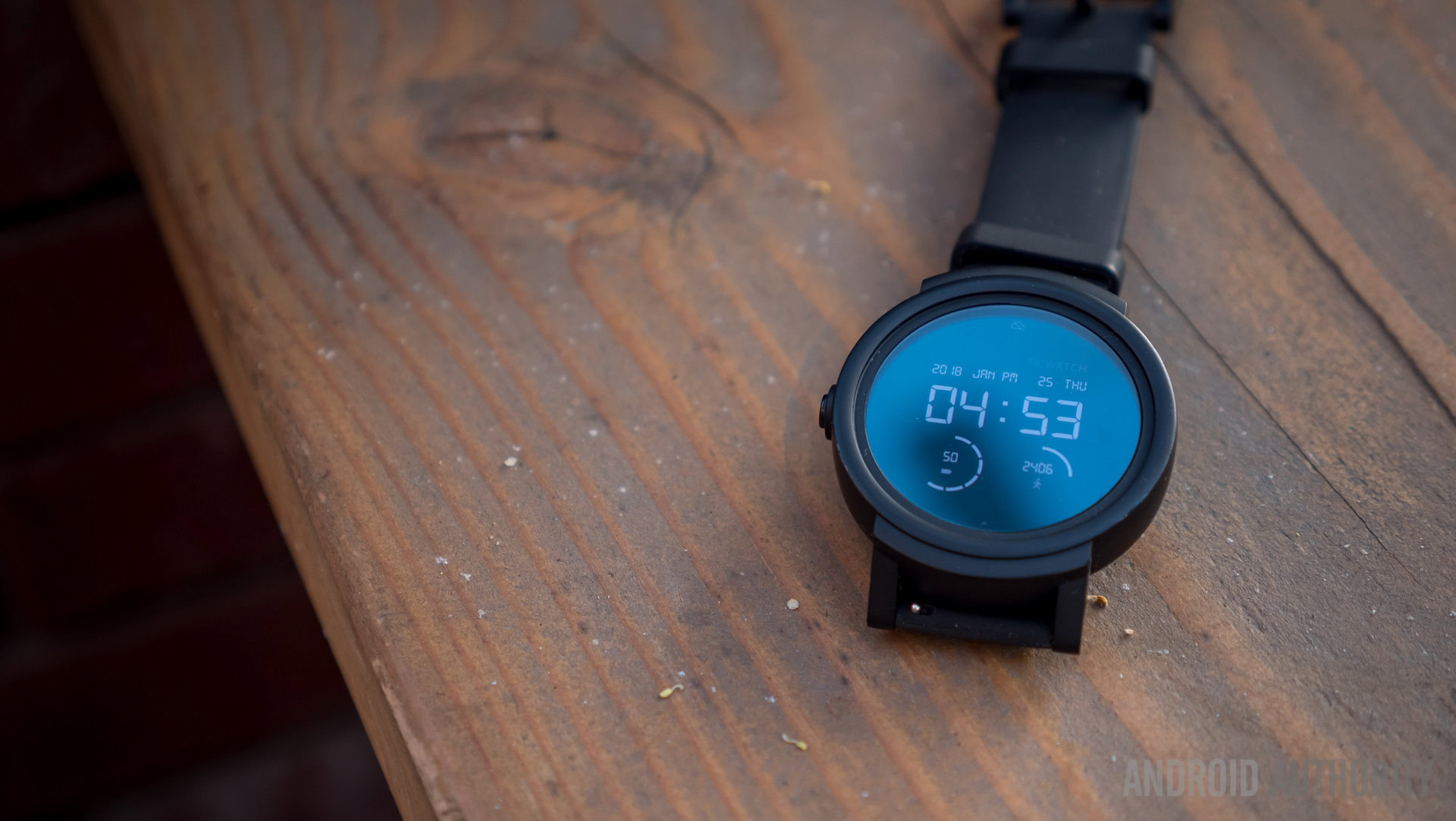
We already made the assertion in the full review that design matters in the case of S vs E. Despite knowing the Ticwatch S was plenty capable, the look and feel left a lot to be desired. That is mostly remedied by the Ticwatch E — our unit is a matte black body with a black silicone band that will not get dirty under normal wear and tear like our S unit did. Though scuffs and dents might occur over time on this completely plastic body, at least they will not be glaring flaws on the black finish.

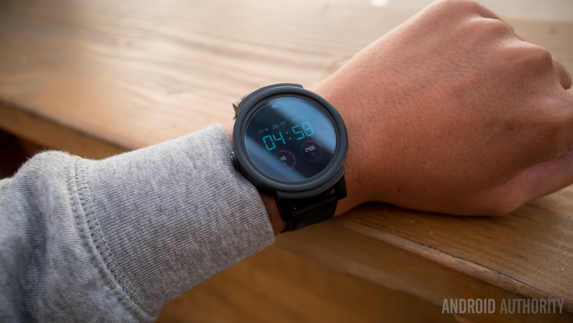
Where the Ticwatch S, as David Imel put it in the full review, screams "I WORK OUT" to just about everyone, the E is more subtle. It worked with pretty much any wardrobe, even those that were more fitness oriented. It isn't like you're missing out on much in the fitness realm either — Mobvoi's app for tracking fitness is nice and rather Apple-esque, though most users probably have their own fitness ecosystems they prefer to install via the Android Wear Play Store.

I made an effort to use the watch for my current obsession: sleep tracking. My favorite Android sleep app, Sleep as Android, works perfectly with this watch but takes up a lot of the battery life when monitoring sleep with continuous heart rate readings. On average, I lost about 50 percent overnight, though I got detailed graphs of my sleep in the app. Battery life from the 350 mAh hasn't changed — it will barely make it to a day and a half when regularly taking in notifications. For my sleep tracking to work, I had to make sure to charge it up before I went to bed. If I wanted to comfortably get through the following day then it required a recharge in the morning too.
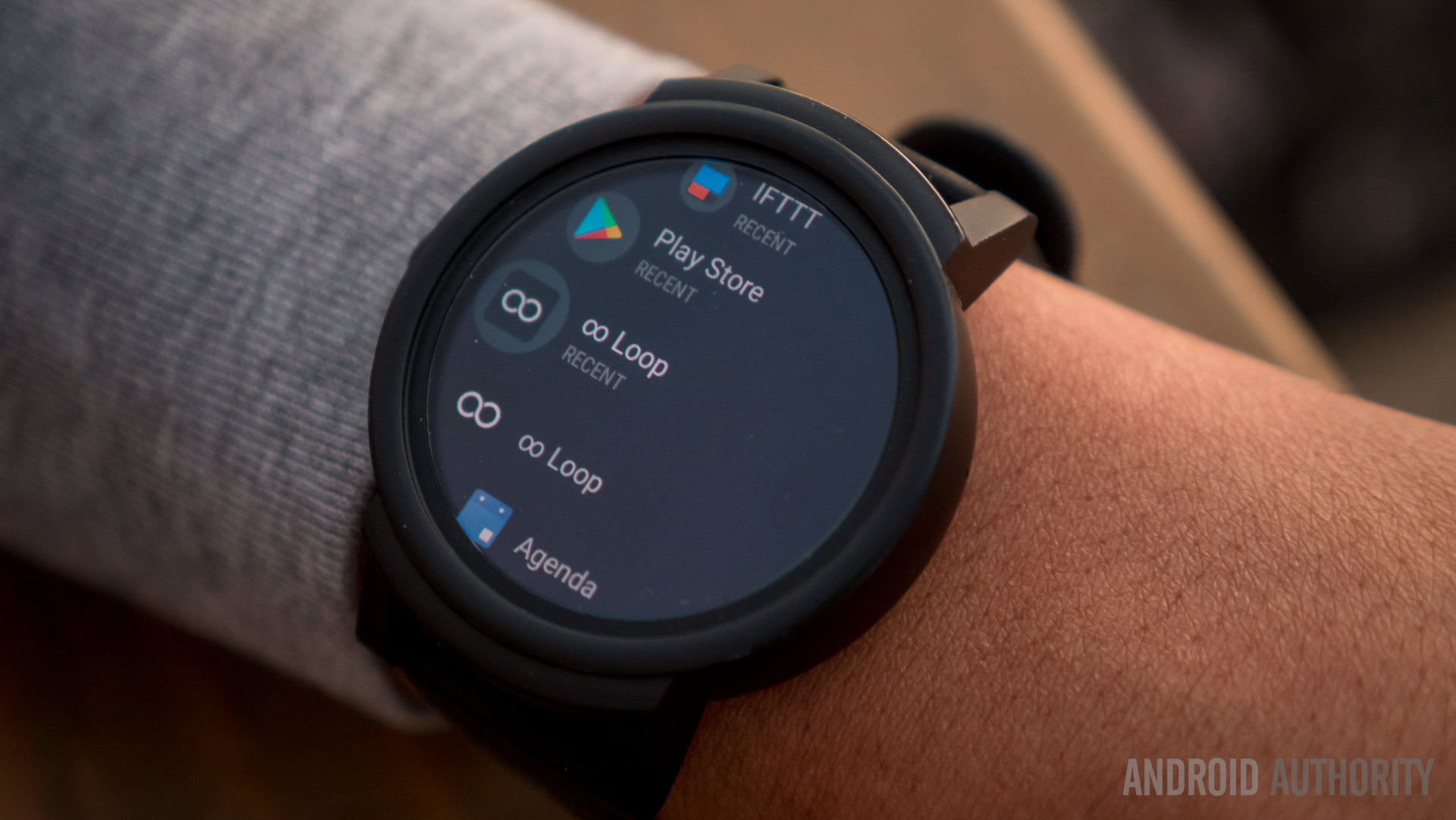
The sleeping example reminded me one of the reasons why Android Wear can be an asset. Its look and operation is due for a complete overhaul, but with the right tools and apps the wrist-mounted OS can be incredibly useful.

There are also other better looking versions of the Ticwatch E than this matted black on black. If you are trying to go for a specific look, there are choices for around the same cheap price. But this black edition is one I can recommend to anyone trying to get into smartwatches that doesn't want anything too big or bulky or flashy. Our review scores and thoughts remain the same, but at least we were able to get the full experience with the Ticwatch E this time.

Here's the bottom line: if you are looking for a starter smartwatch and don't mind Android Wear or that the build quality may one day reflect the price, the Ticwatch E is a compelling offering.
Now, let's get cracking on that Ticwatch 3.
from Android Authority http://ift.tt/2rTFfgC
via IFTTT

No comments:
Post a Comment