A few good ideas with some uninspiring execution.
HTC's attempt at parlaying the brand recognition of the U11 into the lower-end U11 Life didn't particularly work out. It was an entirely forgettable phone with some performance shortcomings — hardly just a "small version of the latest flagship." HTC is at it once again with the HTC U12 Life, which is even further removed in terms of design from the U12 Plus — outside of the fact that it's made out of plastic, of course, it also just lacks even a passing resemblance to the flagship.
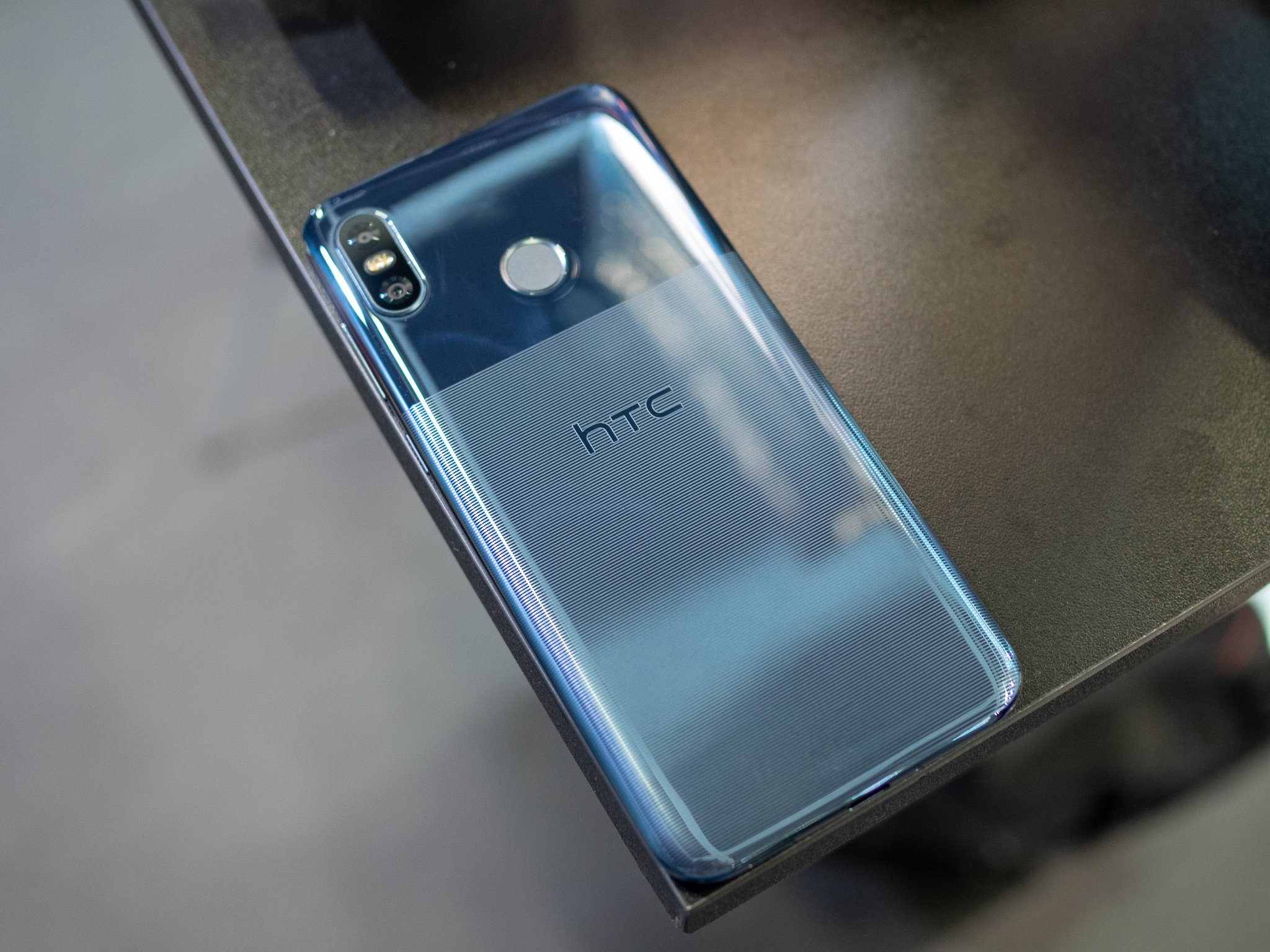
HTC uses the phrase "acrylic glass unibody with a metal like design" to describe the U12 Life. This phone is plastic. All the way through. And that's okay! Lots of inexpensive phones are made out of plastic. And when you just own up to it and make something good of it, nobody cares. HTC did something very interesting with the back of the phone, etching parallel lines across about two-thirds of the back to provide not only a super-unique look but also extra grip and fingerprint resistance. I would love to see this process applied to a full glass-backed phone, and maybe we'll see it in the future.
The rest of the build of the phone looks a whole lot like the U11 Life, which means the plastic is overly shiny and therefore shows off many of the flaws of the cheap materials. It recreates the eye-catching sheen of the U12 Plus from a distance, but in your hand it feels like the mid-range phone it is.
The size lands in the "just right" segment, with a 6-inch 18:9 display that has surprisingly small bezels for this class of phone and isn't hindered by a notch. HTC's picked a quality display from what I can tell, and 1080p resolution is plenty for a mid-range phone. That etched back provides a little extra grip to counteract the slippery sides, but with this display size I had no issues handling and reaching across it.
It's interesting that HTC decided to roll out two colors that are so similar. Ostensibly they are blue and purple, but depending on the lighting they almost identical. The "blue" version is a bit duller and less flashy, while the "purple" has a mirror-like finish that reflects more and is therefore more chrome or metallic as a result. They both look good from a distance, though the evaluation units I handled at IFA 2018 were already heavily gouged in the top non-etched portion of the backs.
Evaluating mid-range phone design is a tough task, because you know the most important features of these phones are things like real-world performance, features and display quality. Those are all things that I can't properly examine in a short time with the phones. Chances are the relatively light HTC software, Snapdragon 636, 4 or 6GB of RAM and 3600mAh battery will get the job done in that respect. So if you're buying based on style, as so many people looking for a smartphone bargain are, the HTC U12 Life checks the box. It isn't a U12 Plus in any way, but if you get past the naming misdirection you'll find this is a really nice inexpensive phone.
from Android Central - Android Forums, News, Reviews, Help and Android Wallpapers https://ift.tt/2wuycLp
via IFTTT

No comments:
Post a Comment